A fresh face reflects renewed relevance.
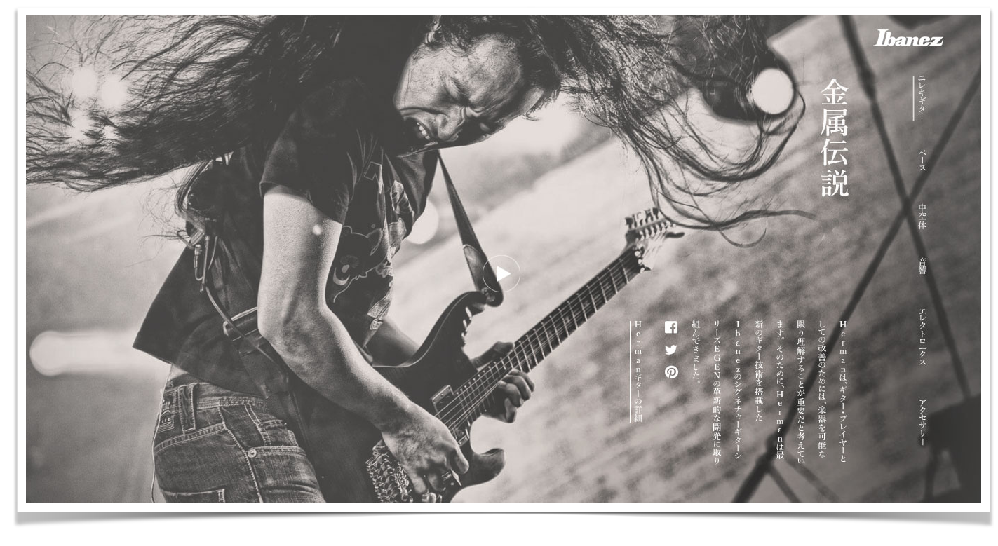
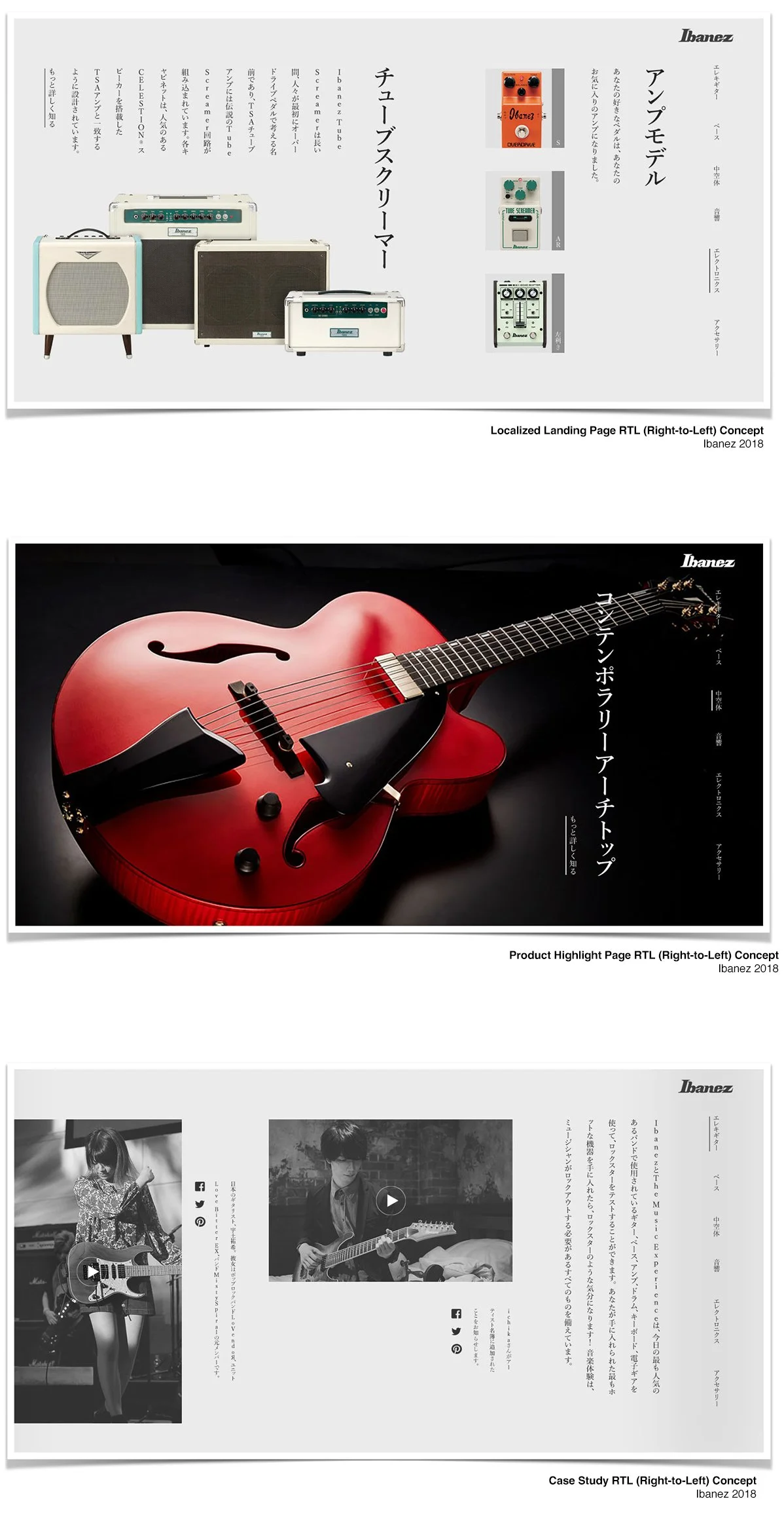
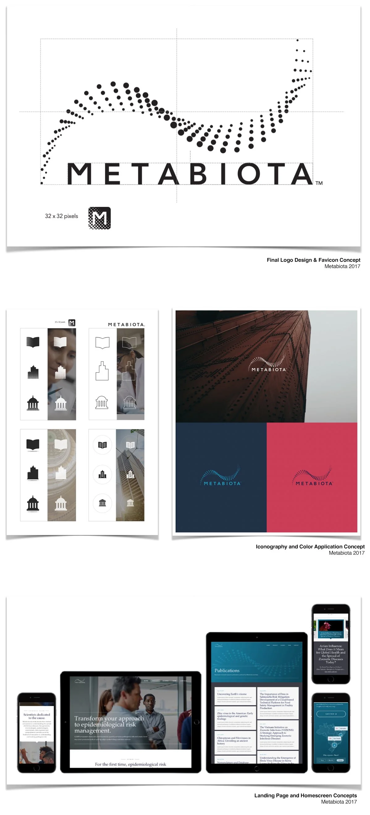
Every brand carries more than a logo—it carries a voice, a tempo, and often an emotion. Building a visual identity begins with understanding the cultural and contextual landscape the brand inhabits. For brands like Metabiota, that means blending precision and trust with a tone that still invites curiosity and imagination. For Ibanez, it means echoing emotion, edge, and heritage in every visual choice.
A visual redesign may not promise a spike in conversion—but it does signal intent.
It tells customers the brand is listening, adapting, and staying present. For fast-moving startups or legacy gearmakers alike, timely visual updates can reframe perception, renew curiosity, and help position the brand for what’s next. Design alone won’t sell—but it absolutely speaks.
Most brand transformation echoes of a deeper narrative. The process of visual iteration respects what came before, while quietly shifting forward. When handled with care, even small changes to layout, tone, or hierarchy can breathe new energy into a brand system—without losing the trust it’s already earned.
Type and tone create more than words.
Fonts carry weight, intention, and psychological nuance. A trusted serif might project legacy, while a minimalist sans serif invites clarity and innovation. The task is to marry the right typeface with the brand's voice—ensuring the visual language feels like a natural extension of what the company wants to say, and how it wants to be remembered.